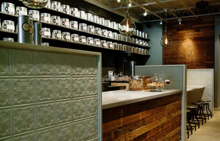

This shabby chic tea company designed by Christine Rossi exhibits great lighting at the sales counter. Differing light levels create shadows and interest, and makes the product behind the counter the focus.
In our previous few posts we have discussed line, colour, and texture and pattern; this post focuses on the ever important light as an element of design. Light is essential to any interior space as it is the means by which we can see our surrounding environment. The feeling of a space can be completely transformed by altering the intensity, placement and colour of light which makes it a very powerful tool. And wherever there is light there are shadows; a favourite saying of one of our professors was, “Shadows are free”.
Any interior designer who has tackled a lighting plan in detail understands that this is not a simple task. There are many considerations that must be taken into account to ensure interior spaces are properly lit for functionality, mood and atmosphere, and sustainability. Since light has both psychological and physiological effects on people it is important to get it right.
Functionality
Different types of spaces have different lighting requirements. In office spaces it is important that workers can complete their tasks, often involving reading printed documents or working at a computer. In retail the lighting should be designed to allow the product to shine (pun intended). The two biggest contributors to functionality from a lighting perspective are quantity and quality.

Jerilyn Wright & Associates did a good job creating some task lighting over the tables while providing a decent amount of ambient light down the corridor. This image is also displaying great examples of line and colour; two previously discussed elements of design.
Quantity
Too little and it becomes difficult to perform necessary tasks. Too much and it causes glare. Both scenarios can cause eye discomfort which lead to health issues, both physical and emotial. The Canadian Centre for Occupational Health and Safety describes good lighting as “providing enough illumination so that people can see printed, handwritten or displayed documents clearly but are not blinded by excessively high light levels (a cause of glare)”.
The three main types of lighting that designers are concerned with are ambient, task and accent.
- Ambient light is the general illumination surrounding the environment or subject. It is indirect and soft, reducing contrast and shadows and is achieved through natural and artificial light sources, as well as reflection from surfaces.
- Task light is that which illuminates a small, specific area. A good example of this is a desk lamp which allows one to add more light to complete a working task.
- Accent light is used to add highlight, drama and focus to interior spaces. This includes directional lighting placed on artwork, or recessed floor lighting to graze the surface of a textured material.
Using these three lighting types correctly and intelligently in a space will ensure that the occupants have the right quantity of light; however this goes hand-in-hand with quality of light.
Quality

This corridor, in the Puro hotel by Blacksheep, uses light as an element of design in way that highlights room entrances and provides a soft, welcoming ambient light. Love how they also incorporated colour and pattern here to emphasize the entry doors.
When it comes to quality of artificial light, designers must consider glare, contrast, uniformity and colour.
- Glare can be either direct, coming straight from a light source, or reflected, shows up on a surface like your computer screen. Neither is good and lighting should be designed to reduce glare.
- Contrast describes a difference in illumination level between two points. We need contrast to distinguish one thing from another, printed words contrast their white background and allow us to read them. Too much contrast can limit our ability to see fine detail and cause eye fatigue.
- Uniformity refers to the overall space, and affects how comfortable one is within the space. Too uniformity is not usually desirable; this can create a bland space without interest and highlight. Have you ever been in a commercial space with fluorescent lighting where some bulbs are warm and some are cool? This makes the space uncomfortable to be in.
- Colour in lighting describes how the colour of a light source affects the colour of surrounding objects. This is a huge topic in the design world with the main factors being colour temperature and colour rendering. For a little more information on these check out our previous post on the subject.
Mood and Atmosphere
Lighting has a dramatic affect on the mood and atmosphere of an interior space; different schemes are used depending on the purpose of the space. Some of the best examples of mood lighting in commercial interior design are restaurants and bars. From brightly lit and loud diners, to romantic candlelit restaurants, to mysteriously dim night clubs, lighting intensity and colour are valuable tools for creating a desired mood. And, of course, a good designer will also use those free shadows to enhance the lighting design.
Light is a powerful tool, and as an element of design it must be carefully planned to suit the space it is illuminating. The inclusion of a couple of different schemes within one space can singlehandedly change the perceived use of a space; think art gallery by day, party venue by night. By designing using dimming control and switching to allow a number of different lighting scenarios a space can become extremely versatile with little else.

Talk about mood lighting! The Shiro in New Dehli goes from dinner to night club with a fantastic lighting design.
Sustainability
Sustainability is another important factor when considering the design of light in a space. Daylight is free and comes without electricity bills attached, and also has many benefits to occupants of an interior space. But daylight cannot be our only source of light, so how do we light up our spaces in an environmentally responsible way?
There are many energy efficient lighting options out there to choose from. These are ever evolving and improving in a response to our more sustainably minded modern society. From fluorescent, to LED, to high pressure sodium; there is a suitable solution for every situation. We feel that it is very important that the functionality of the light source be considered first with the effective means of achieving this following. LED are very popular in today’s market, but by no means are they the right solution to every lighting problem.

The Plumen bulb is a ‘designer low energy light bulb’ that is a great alternative to the spiral CFL bulbs.
There is no doubt that light is a terrifically important element of interior design. Ensure that this is done not only aesthetically, but also scientifically to properly and effectively light your interiors. Correct use can increase employee productivity and reduce number of sick days, help to sell your products, and lure passersby into your restaurant or lounge.
Did you miss our post about line? Read about it by clicking here.
Did you miss our post about colour? Read about it by clicking here.
Did you miss our post about texture and pattern? Read about it by clicking here.
» Do you need help with your commercial Interior Design project? Contact Hatch Interior Design located in Kelowna, British Columbia – Because Good Design is Good Business.